library(ezGenomeTracks)
#> Warning: replacing previous import 'AnnotationDbi::select' by 'dplyr::select'
#> when loading 'ezGenomeTracks'
#> ezGenomeTracks v0.0.13
#> Easy and flexible genomic track visualization
#> Use citation('ezGenomeTracks') to see how to cite this package
#> For documentation and examples, visit: https://github.com/zmu/ezGenomeTracks
library(ggplot2)
The most common use of genome browser tracks is to plot coverage of
sequencing data. In most cases, we have a bigwig file and a
particular region that we want to plot. This is also one of the most
basic situation for using ezGenomeTracks.
Load example data
bw0 <- system.file(
  "extdata",
  "avg_chr2-231091223_231109786_231113600_0.bw",
  package = "ezGenomeTracks"
)
bw1 <- system.file(
  "extdata",
  "avg_chr2-231091223_231109786_231113600_1.bw",
  package = "ezGenomeTracks"
)
bw2 <- system.file(
  "extdata",
  "avg_chr2-231091223_231109786_231113600_2.bw",
  package = "ezGenomeTracks"
)
Use ez_coverage function
Plot a single coverage track
ez_coverage(
  input = bw0,
  region = "chr2:231109000-231115000"
)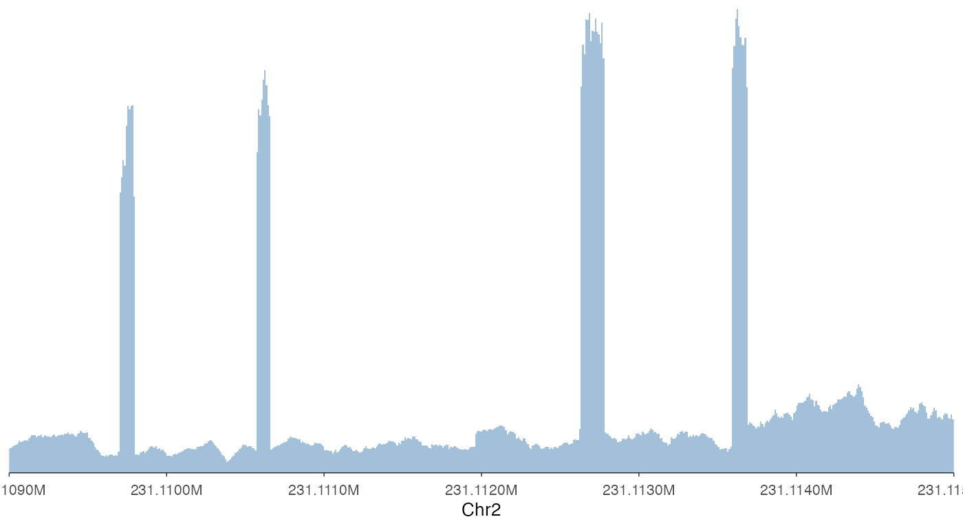
Note that ez_coverage, like all other ez_*
wrappers, automatically convert the x-axis to readable scales.
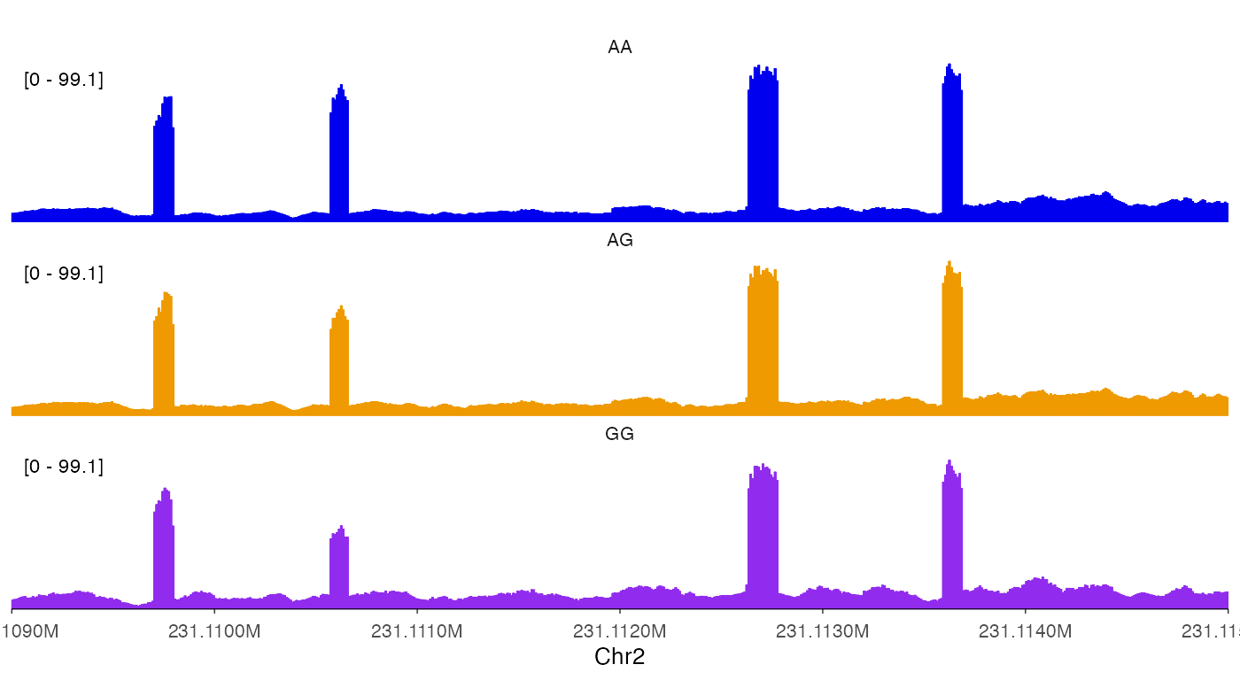
Plot stacked coverage tracks
To plot stacked tracks, use a list() for
input to ez_coverage.
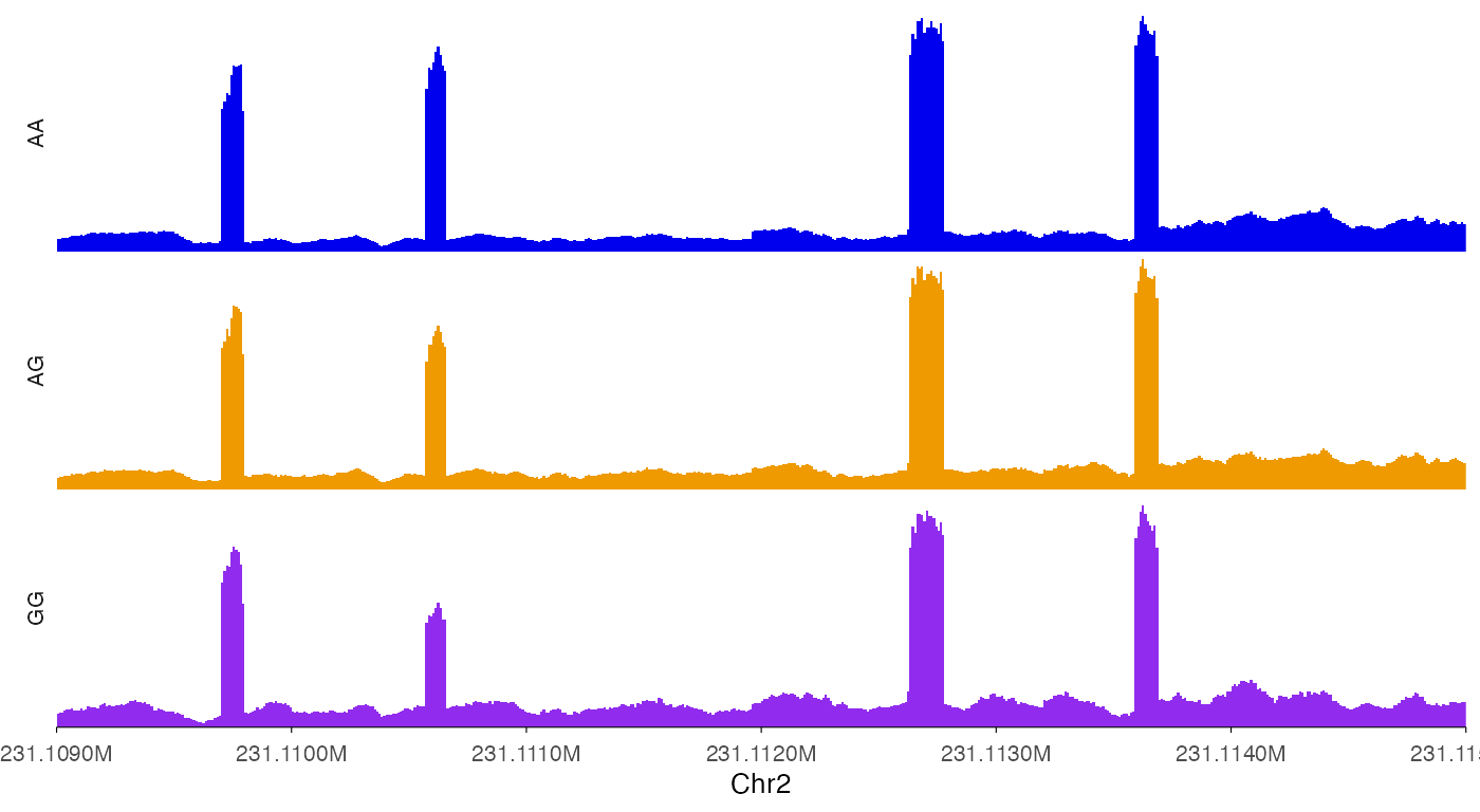
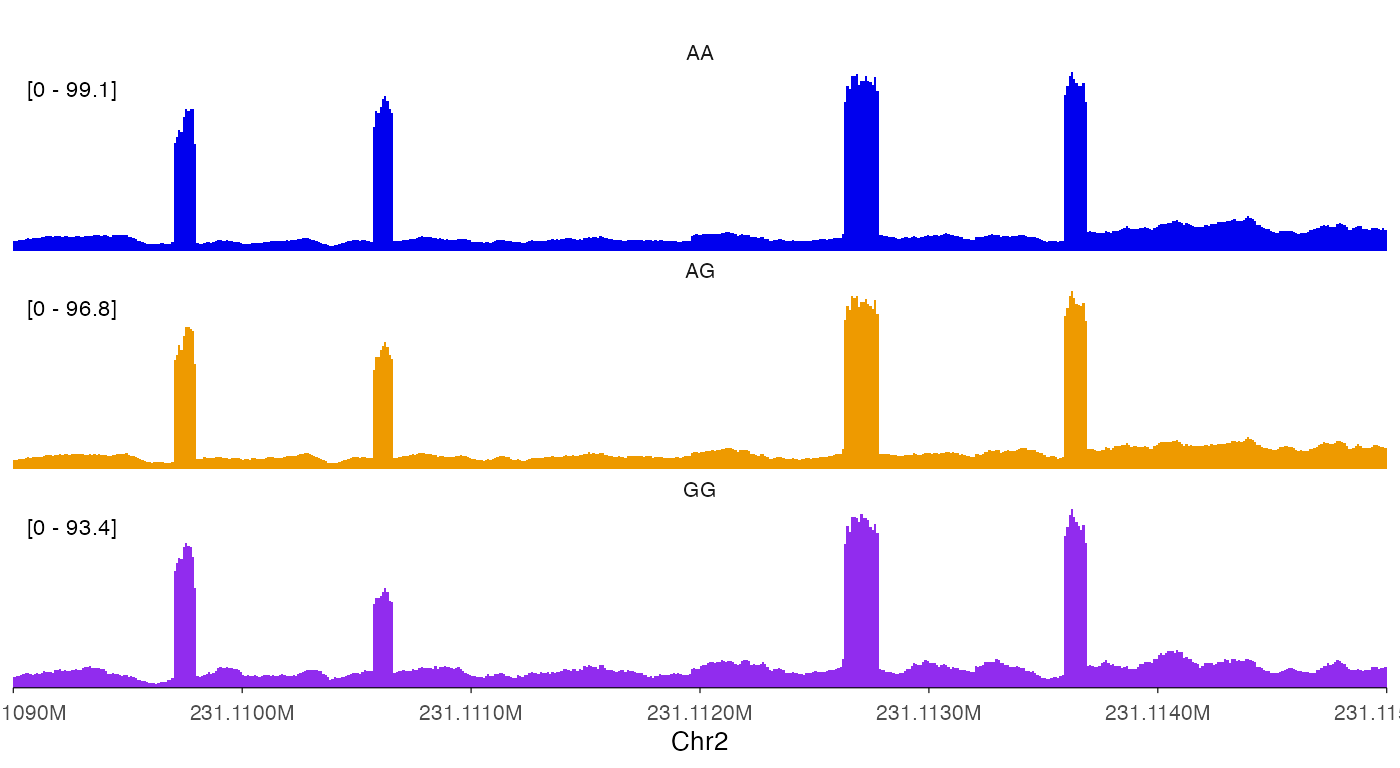
ez_coverage(
  input = list(bw0, bw1, bw2),
  region = "chr2:231109000-231115000",
  y_axis_style = "full"
)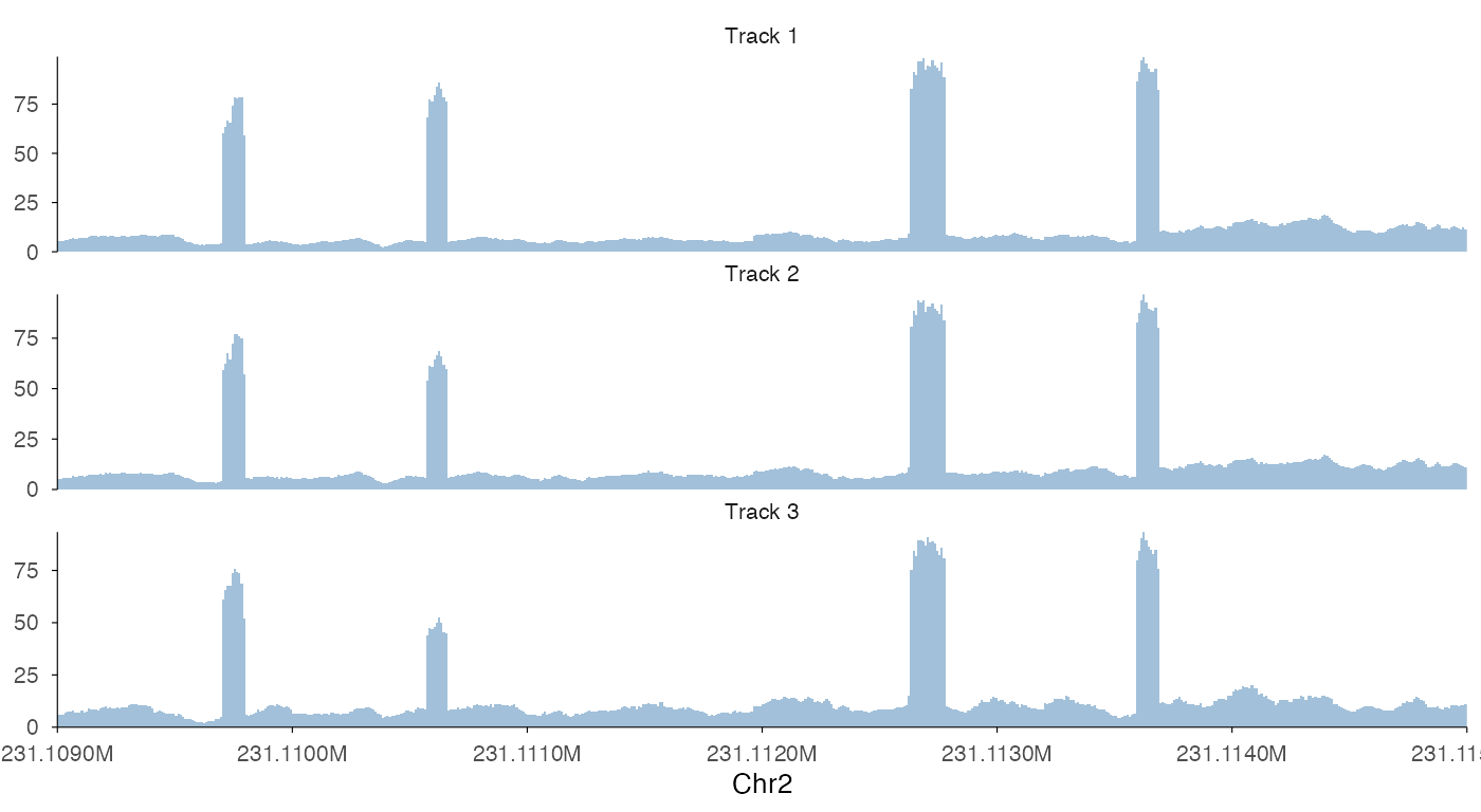
ez_coverage(
  input = list(bw0, bw1, bw2),
  region = "chr2:231109000-231115000",
  y_axis_style = "full",
  colors = c("blue2", "orange2", "purple2"),
  alpha = 1,
  track_labels = c("AA", "AG", "GG")
)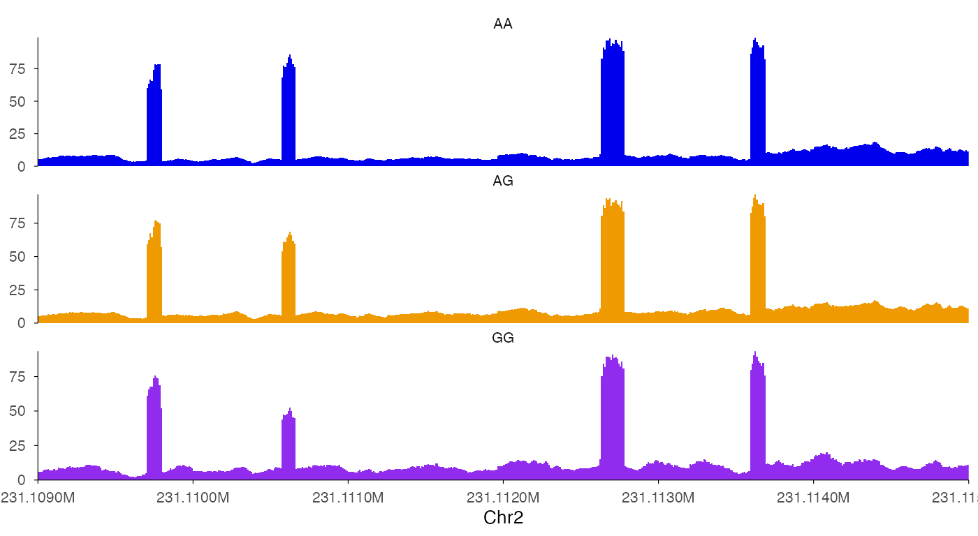
There are two notable things in the above examples. First, we can use
show_legend = T add legends back. Second, the stacked
tracks are implemented as facets in ggplot2, we can use
facet_label_position = "left" to put it on the left of the
tracks.
Plot overlapping coverage tracks
In some cases, we want to plot overlapping tracks to compare coverage
heights. To do so, use a vector for input
to ez_coverage.
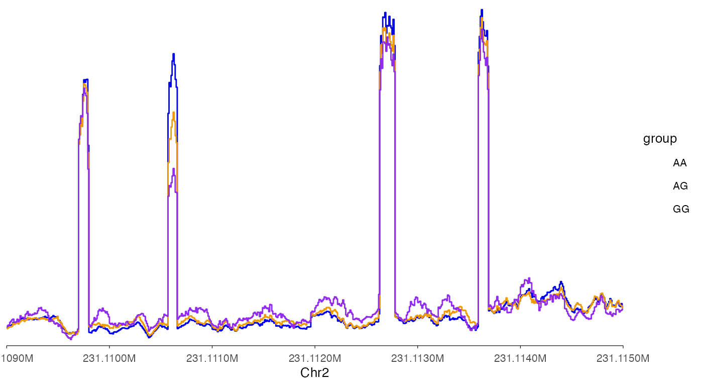
ez_coverage(
  input = c(bw0, bw1, bw2),
  region = "chr2:231109000-231115000",
  type = "area",
  y_axis_style = "none",
  y_range = c(0, 100),
  colors = c("blue2", "orange2", "purple2"),
  alpha = 1,
  track_labels = c("AA", "AG", "GG"),
  facet_label_position = "left",
  show.legend = F
)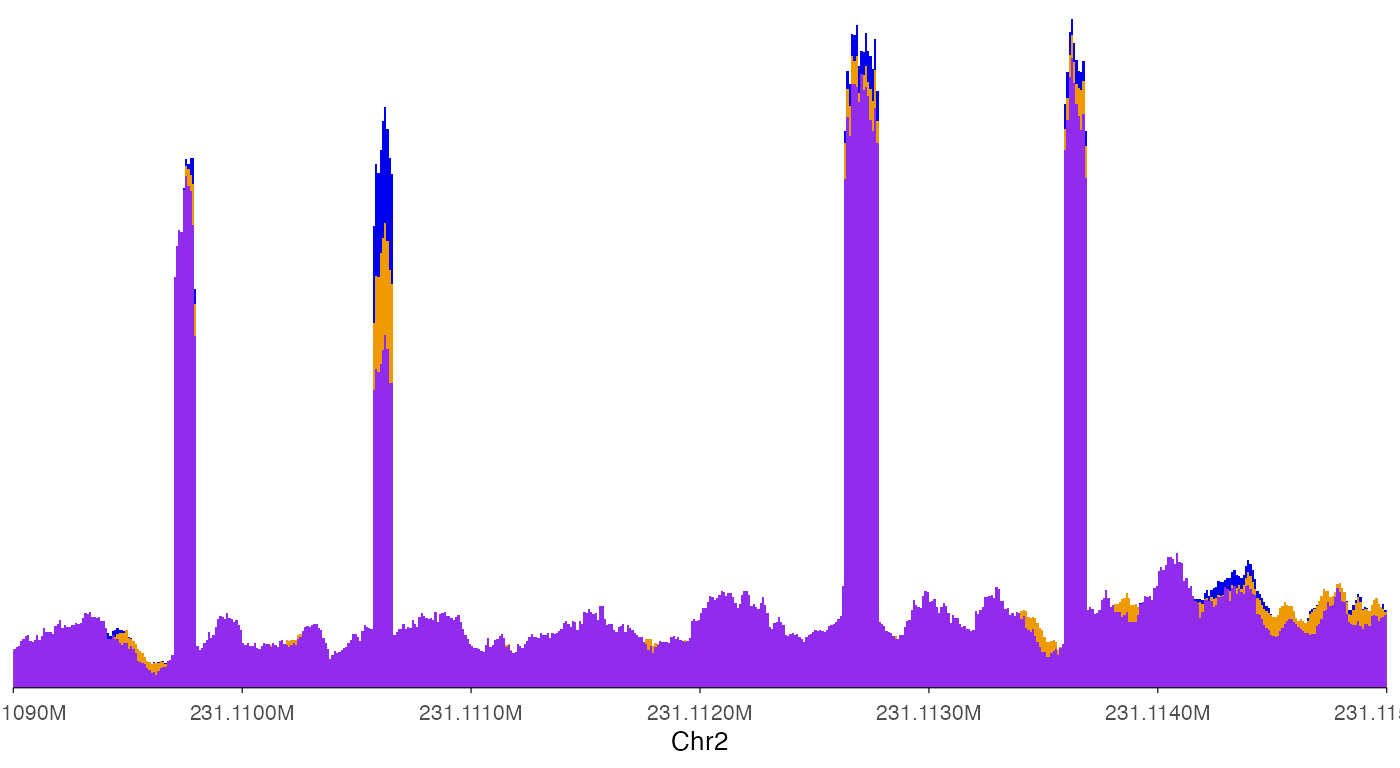
In this way, it is clear that the second exon in this plot showed differential usage across the three genotypes.
Averaging signals across samples
In some cases it is desirable to average signal across multiple samples, such as across donors with the same genotype.
ez_coverage(
  input = c(bw0, bw1, bw2),
  region = "chr2:231109000-231115000",
  type = "line",
  average_bin_width = 5,
  average = T,
  y_axis_style = "full",
  facet_label_position = "left",
  show.legend = F
)
Changing the looks of coverage track
Set y-axis range to all tracks, but hiding y-axis labels.
ez_coverage(
  input = list(bw0, bw1, bw2),
  region = "chr2:231109000-231115000",
  y_axis_style = "none",
  colors = c("blue2", "orange2", "purple2"),
  alpha = 1,
  track_labels = c("AA", "AG", "GG"),
  facet_label_position = "left",
  y_range = c(0, 100)
)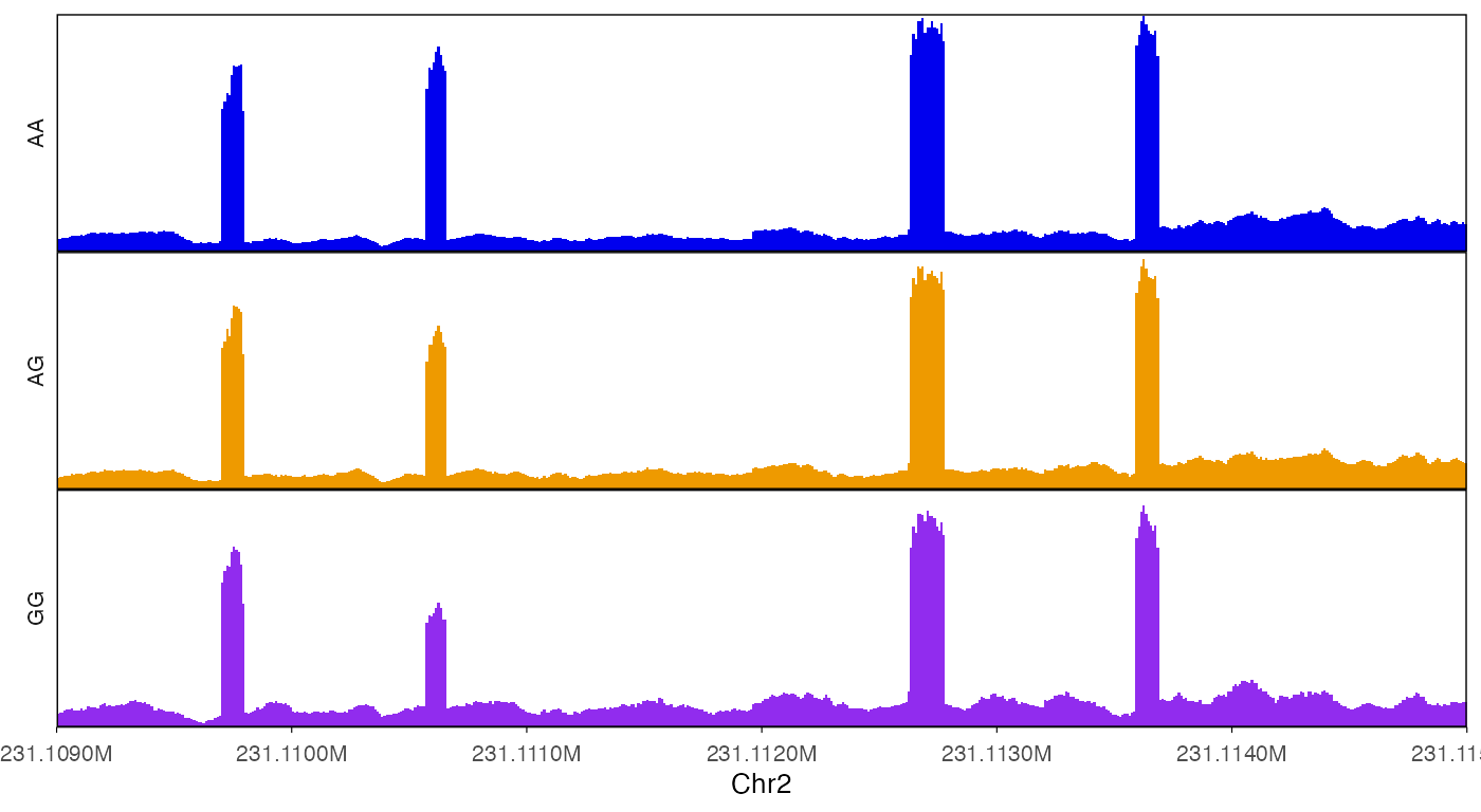
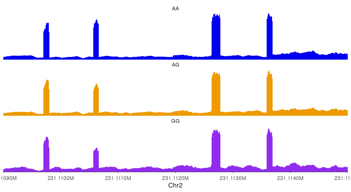
Add border around tracks.
ez_coverage(
  input = list(bw0, bw1, bw2),
  region = "chr2:231109000-231115000",
  y_axis_style = "none",
  y_range = c(0, 100),
  colors = c("blue2", "orange2", "purple2"),
  alpha = 1,
  track_labels = c("AA", "AG", "GG"),
  facet_label_position = "left",
  border = T
)
Draw lines for coverage.
ez_coverage(
  input = c(bw0, bw1, bw2),
  region = "chr2:231109000-231115000",
  type = "line",
  y_axis_style = "none",
  y_range = c(0, 100),
  colors = c("blue2", "orange2", "purple2"),
  alpha = 1,
  track_labels = c("AA", "AG", "GG"),
  facet_label_position = "left",
  show_legend = T
)
Change y-axis style.
ez_coverage(
  input = list(bw0, bw1, bw2),
  region = "chr2:231109000-231115000",
  y_axis_style = "simple",
  colors = c("blue2", "orange2", "purple2"),
  alpha = 1,
  track_labels = c("AA", "AG", "GG")
)
ez_coverage(
  input = list(bw0, bw1, bw2),
  region = "chr2:231109000-231115000",
  y_axis_style = "minmax",
  colors = c("blue2", "orange2", "purple2"),
  alpha = 1,
  track_labels = c("AA", "AG", "GG")
)
ez_coverage(
  input = list(bw0, bw1, bw2),
  region = "chr2:231109000-231115000",
  y_axis_style = "none",
  colors = c("blue2", "orange2", "purple2"),
  alpha = 1,
  track_labels = c("AA", "AG", "GG")
)
Use geom_coverage function
For advanced users that hope to do more customization with the plots,
geom_coverage can be directly used with ggplot
calls.
bw0_cov <- rtracklayer::import(bw0) |>
  granges_to_df()

head(bw0_cov)
#>   seqnames     start       end width strand    score
#> 1     chr2 231106786 231106787     1      * 11.65226
#> 2     chr2 231106787 231106788     1      * 11.65226
#> 3     chr2 231106788 231106789     1      * 11.65226
#> 4     chr2 231106789 231106790     1      * 11.65226
#> 5     chr2 231106790 231106791     1      * 12.09351
#> 6     chr2 231106791 231106792     1      * 12.09351
ggplot(bw0_cov) +
  geom_coverage()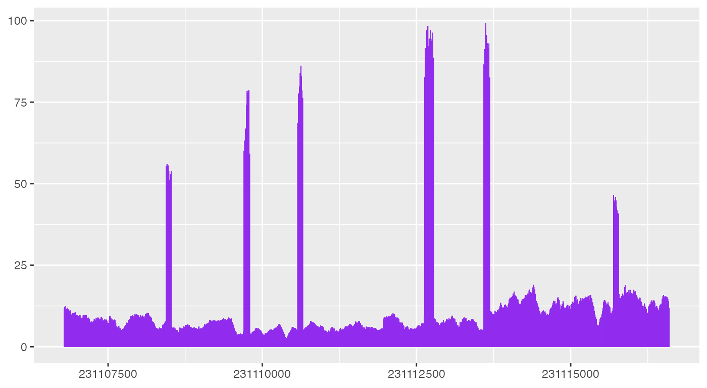
As shown above, geom_coverage automatically looks for
default columns need to plot coverage data, but more code are needed to
make the plot look like what ez_coverage outputs.